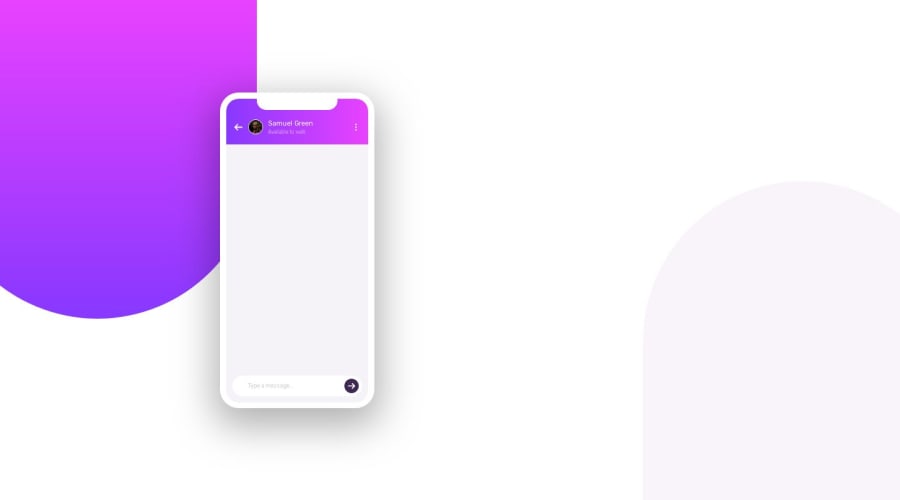
Design comparison
Community feedback
- @mattstuddertPosted over 4 years ago
Awesome work on this challenge, Fatih! Sorry about the screenshot not removing the animations. It should do that so the screen isn't blank for your solution but obviously there's an issue with that I need to look into.
Your solution looks great. My only small piece of advice would be to speed up the animations. They take quite a while to complete at the moment, so could be edited to make them a bit more snappy 👍
1
Please log in to post a comment
Log in with GitHubJoin our Discord community
Join thousands of Frontend Mentor community members taking the challenges, sharing resources, helping each other, and chatting about all things front-end!
Join our Discord
