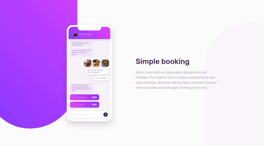
Design comparison
Solution retrospective
-
Layout was created implementing mobile first 📱 approach.
-
Fade-in entrance animation.
I used div for all of the elements of app illustrations(except images) since this isn't the common way to add illustrations to websites(expecting to be showered by HTML reports 😬).
So any feedback on how I can improve the code is greatly appreciated. 🖤
Thank you :)
Community feedback
- @MelvinAguilarPosted over 1 year ago
Hello 👋. Good job on completing the challenge !
I opened your solution on a mobile device and noticed that it is not possible to scroll. Looking at your code, I realized that you used
overflow: hiddenon the body element, which disables scrolling.Above all, the solution you submitted is great!
Happy coding!
Marked as helpful0
Please log in to post a comment
Log in with GitHubJoin our Discord community
Join thousands of Frontend Mentor community members taking the challenges, sharing resources, helping each other, and chatting about all things front-end!
Join our Discord
