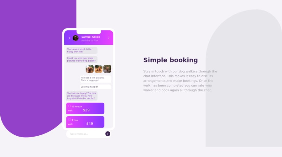
Chat App Illustration Master using flex display and positioning
Design comparison
Solution retrospective
This challenge took a lot of time and i think i have made it look complex. If anyone can review and suggest me the areas I need to work on will be helpful.
p.s. The background color is different from the challenge given.
And also when I open my site it looks fine, but in design comparision the "type a message" section goes out of "div" element. Can someone let me know the reason?
Now planning to go ahead with Javascript learning, so would love to know which areas i need to improve before moving ahead.
Community feedback
- @mattstuddertPosted over 3 years ago
Nice attempt at this challenge, Indu! That is odd about the screenshot. As it runs on a slightly older version of Firefox at the moment, it seems to be rendering your solution differently. The input is being pushed down because the two radio selection messages above render over two lines in the screenshot. I wouldn't worry too much about it though 🙂
I'd recommend removing the
float
property from the repertoire for the most part. Now that we have Flexbox and Grid, floats shouldn't be used for layout purposes anymore.Overall you've done a good job, though! The main thing I'd recommend would be to spend some time refining the details a bit to get it matching up closer to the design. Attention to detail is a key part of being a front-end developer, so projects like this are a great way to practice.
Did you learn anything new while working through this challenge? It's a tricky one!
Keep up the great work! 👍
0@InduRajputPosted over 3 years agoThanks for the feedback @mattstuddert
Yes Matt, Definetely I learned many things while working on this challenge. Not only this challenge, I love most of the challenges given here and try to complete one challenge per day and this particular one took nearly 2 days to complete it :) But looking at the end result I feel happy & as an accomplishment(ha ha).
Thank you for creating this platform for us :)
0@mattstuddertPosted over 3 years ago@InduRajput that's awesome! I'm really happy to hear you're finding the challenges useful! 🙂
0
Please log in to post a comment
Log in with GitHubJoin our Discord community
Join thousands of Frontend Mentor community members taking the challenges, sharing resources, helping each other, and chatting about all things front-end!
Join our Discord