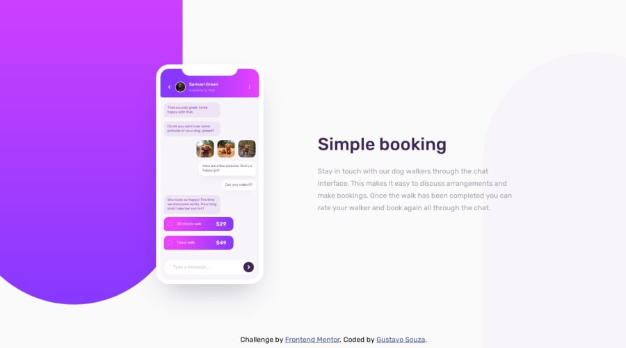
Chat app illustration made using React and Vite
Design comparison
Solution retrospective
I'm proud that I managed to code the styles and the final result is almost identical to the design. This means that my CSS skills are ok. The next time I want to use some CSS tools to help with my CSS coding, like Tailwind and Sass.
What challenges did you encounter, and how did you overcome them?The part of the design I found most difficult to code was the chat app messages. It's not perfect, but for this project it's ok. If anyone has any tip about how I could improve specifically this part of the CSS or any other thing, please tell me.
What specific areas of your project would you like help with?The mobile app was messed up. But I found that the problem was with the position of the stripes (those two things in the background of the app). So I changed the right one to the fixed position and the problem was fixed (literally). Other than that, if there's any feedback on how I should improve my code, please tell me.
Community feedback
Please log in to post a comment
Log in with GitHubJoin our Discord community
Join thousands of Frontend Mentor community members taking the challenges, sharing resources, helping each other, and chatting about all things front-end!
Join our Discord
