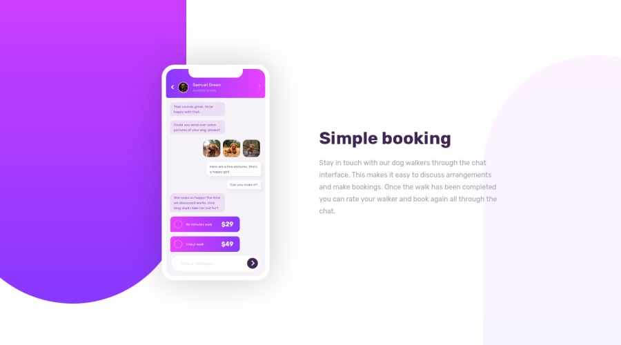
Design comparison
Solution retrospective
When started the challenge why this is marked as intermediate thinking they might provided all the images. But when I started coding I came to know that I have to make everything using css.It was fun though. Please leave your suggestions :)
Community feedback
- @Kamasah-DicksonPosted almost 3 years ago
You did a very good job there I think that will be my next projectπͺ
Marked as helpful1 - Account deleted
Hi there π
Congratulate on finishing your project π. You did a great job π¨. Yes even though work the challenging result is always worth it πππ
I give some suggestions that I hope help you take your project to the next level π. To make the app looks like a real app or maybe a real phone, add some cursor effects. When you hover one Profile name and img, 3 dots and go back buttons, also send button, change the cursor pointer π. The last thing add some hover effect like changing colors to text messages.
Happy coding β Maqsud
Marked as helpful1
Please log in to post a comment
Log in with GitHubJoin our Discord community
Join thousands of Frontend Mentor community members taking the challenges, sharing resources, helping each other, and chatting about all things front-end!
Join our Discord