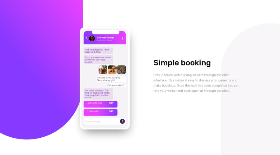
Chat app CSS illustration solution
Design comparison
Solution retrospective
In this project I learned how to use the "z-index" property and the "animation" property with @keyframes and I am really looking forward to know more about them especially they are largely supported and they can be rerally usefull in many situations. I did the background shapes using divs, which is not the best for responsive design but I tried to play with the medias, I didn't find the need to use SVGs, but if there is a better way to do it or there any other suggestion that would apprecited any feedback is appreciated too. I also need your help on customizing the nav btns and the arrow of the header, I am sure there is an easier and cleaner way to do them. Good coding journey for all ;)
Community feedback
Please log in to post a comment
Log in with GitHubJoin our Discord community
Join thousands of Frontend Mentor community members taking the challenges, sharing resources, helping each other, and chatting about all things front-end!
Join our Discord
