Design comparison
SolutionDesign
Solution retrospective
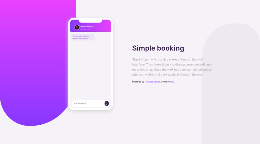
Can anyone help me with the background designs? I couldn't make them less rounded.. Also, any feedback is welcome!
Community feedback
- @RJC26Posted over 2 years ago
hey man with the background you need them to surpass the edge of the viewport so you should try giving them a
position: fixed;then for the purple one tryleft: -200px;top: 0;then just style the height to however long you want it, this will push it off the page slighty and it should look better, as for the right grey background peice you would want to swap it sobottom: 0right: 200px;etc.. hope this helps!Marked as helpful1
Please log in to post a comment
Log in with GitHubJoin our Discord community
Join thousands of Frontend Mentor community members taking the challenges, sharing resources, helping each other, and chatting about all things front-end!
Join our Discord
