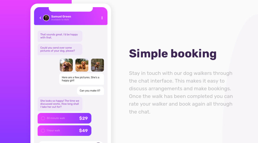
Design comparison
Solution retrospective
It was really fun to make.
However I have no clue how to manage the responsive part (everything breaks below 500px), do you know if there is a way to stretch the whole phone part like you would do with an img
having a width: 90%
property ?
Community feedback
- @grizhlieCodesPosted over 3 years ago
This does look like a fun one! Overall great result π
As to 'everything' breaking - this is mostly because you used some 'fixed' values. For example, the menu/options button (3 dots, top right)
class="fas fa-ellipsis-v icon"
haspadding-left: 170px
. This generally won't be a good idea as now even if the display makes the phone-container too small to contain theprofile-wrapper
this will take up 170px anyway. A better solution is to let the browser handle this. So here is a suggestion:/* remove*/ padding-left: 170px;
/* add */ flex-grow: 1; text-align: right;
This will make the space between the menu and the text dynamically grow/shrink as the menu will take up all available horizontal space it can (if i can grow, I will grow sort of thing). That's the beauty of flexbox.
Then you will notice that the menu is now hugging the end of its' container. You might be tempted to just add
margin-right: 30px
but I suggest do the below instead:/* remove */ .fa-chevron-left { /* margin-left: 30px; */ }
/* add */ .profile-wrapper { /* other code*/ padding: 0 30px; }
Now we have shipped the job of creating white space from 2 elements into 1 element, the parent element
profile-wrapper
. This I think is a better practice to get used to. Incase you haven't usedpadding
and instead used p-top,bottom etc - it's a shortcut forpadding: padding-top padding-right padding-bottom padding-left;
But if you just leave padding-top and padding right in it, it will apply the same to bottom and left. So it's a shortcut within a shortcut.
One more shortcut I would suggest/expose to you:
/*remove*/ .profile-wrapper { border-top-left-radius: 30px; border-top-right-radius: 30px; border-bottom-left-radius: 8px; border-bottom-right-radius: 8px; z-index: 10; } /*add*/ .profile-wrapper { border-radius: 30px 30px 8px 8px; }
More or less the same concept as padding, but instead of starting top, we start at top-left π.
I hope that the main takeaway from my dribble is to:
- What can be made dynamic, should be made dynamic. Controlling a position of an element can be done with margins etc but it can be done better by utilising something like flex-box and then using 'align-self' or 'justify-self' for the right/left/top/bottom positioning of the element in comparison to its' parent.
Same for the width of an element. The element itself doesn't need a fixed margin etc. You can use things like flex-grow for this.
The idea is to let the browser do the lifting/calculating for you.
-
Let the parents control paddings of their children. Using margins on children just adds work unnecessarily.
-
Lastly -
class="white-msg short"
this has the same problem as the menu had. Should be an easy fix now π
Edit: let me know if you need help on anything else or I didn't explain myself properly.
Cheers!
Marked as helpful2@pierre-pellegrinoPosted over 3 years ago@grizhlieCodes Hey Rafal, wow huge thanks for such a comment !
I knew, when I made it, that it was a bad idea to use absolute values π
Unfortunately I'm not currently able to fix my code, but I will take every advice you gave me once I can access my computer !
I will update my solution and comment again as soon as I can do it ! Once again thanks a lot for this awesome comment, it is going to help me a lot with it !!
1@grizhlieCodesPosted over 3 years ago@PierreWagon Iβm glad I could be helpful. Let me know when youβve updated it for sure π
1@pierre-pellegrinoPosted over 3 years ago@grizhlieCodes Hey ! I finally had some time to finish it !
I've read your comment like 10 times and learned a lot of stuff thanks to you.
For my
.white-msg
I did something a bit different, I just gavedisplay: flex
to their container andjustify-content : flex-end
to them, it seems to do the job nicely !Huge thanks once again, your comment helped me a lot.
1@grizhlieCodesPosted over 3 years ago@PierreWagon Awesome, well done on improving it :). I like redoing some projects, really great way to re-enforce certain lessons.
Happy you found my comment helpful π
Good thinking on usitilising flex that way for the
.white-msg
element.Whilst I don't think that flexbox is easy (because there's a lot to it, it's easy to get into but not as easy to understand completely) I do think it's crucial to constantly improve your understanding of it. You and I are the lucky generation of developers that don't have to know the pain of html tables and floats etc to position things well.
Kevin Powell (YouTuber) has a great course that's affordable for $37 (Flexbox simplified) that I would highly recommend if you want to kick your knowledge up a few levels π.
Best way to reinforce your lessons now is when you study the design from another Frontend Mentor challenge, really think how and where you would apply things like flex-box, how you'd position things, how you would ensure that the browser does most of the heavy lifting and you just code everything 'dynamically'.
Happy coding π
0@pierre-pellegrinoPosted over 3 years ago@grizhlieCodes I must say the more I'm using Flexbox the more I love it. Even if I'm not fully understanding it, it just seems so powerful. (I'm coming back to IT since like two months but I passed a computer science degree in 2012... HTML5 was not even existing yet π±)
I will give a look to Kevin Powell's ! I'm also beginning a 6-month training course in september, can't wait !
I will be using CSS Grid today and try to make the "Calculator App" project, but I will come back to Flexbox as soon as it is finished .π
1
Please log in to post a comment
Log in with GitHubJoin our Discord community
Join thousands of Frontend Mentor community members taking the challenges, sharing resources, helping each other, and chatting about all things front-end!
Join our Discord