

Design comparison

Solution retrospective
I am really proud to complete this project alone. This project really helped me to understand the use of position more as I struggle to use it properly.
To spend less time on project especially for this chat app, there is no much text to write other than layout and positioning but for some reason I struggled to get the position right quickly.
What challenges did you encounter, and how did you overcome them?Positioning. I kept trying different ways till I was able to get it to be responsive properly. I am a perfectionist and want my project to look exactly as the design given. Glad I am able to do that
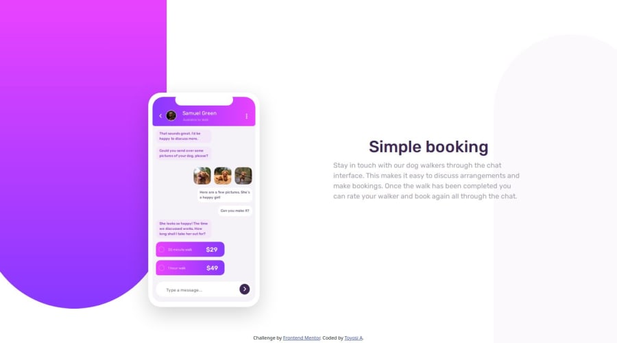
What specific areas of your project would you like help with?The last bit. Mobile version look. My mobile version is responsive for all devices even beyond 320 screen size. If I increase the length of the mobile to a much larger height, the (SIMPLE BOOKING) doesn't follow the bottom div. Maybe its nothing to worry about but other people's project looks different in that area. I will appreciate anyone who preview my work and suggest what to improve on Note: I used PX for the mobile design and no mobile is 2000px in height, Maybe Its nothing to worry about but I will appreciate recommendations.
Community feedback
Please log in to post a comment
Log in with GitHubJoin our Discord community
Join thousands of Frontend Mentor community members taking the challenges, sharing resources, helping each other, and chatting about all things front-end!
Join our Discord