Design comparison
SolutionDesign
Solution retrospective
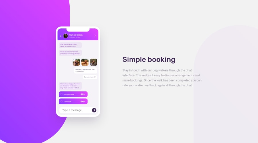
Using flex and a lot of divs. The mobile screen and app turned out quite well but the background divs are not the best to position in a responsive way..
The way I would have liked to position them would have been always fixed to the side edges of the viewport, no matter the resolution, but with slightly different positions in desktop view vs mobile view. Any suggestions are welcome.
Community feedback
Please log in to post a comment
Log in with GitHubJoin our Discord community
Join thousands of Frontend Mentor community members taking the challenges, sharing resources, helping each other, and chatting about all things front-end!
Join our Discord
