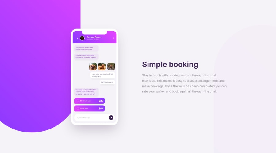
Design comparison
Solution retrospective
This is a really fun project. I think also doing the challenges on CSS Battle really helped me be able to knock this project out this time.
Community feedback
- @idesmarPosted almost 4 years ago
Great work! I didn't exactly know if I should make a real form at the bottom of the phone. I ended up making it as one. LOL!
Big props on your code, by the way. Very clean and understandable.
I might be wrong here but was it supposed to be an arrow or a phone icon at the left of the profile photo? If it was an icon, using an SVG either inline or using a library like fontawesome would be the way to go. That would also work for the dots at the right hand side.
1P@palgrammingPosted almost 4 years ago@idesmar yes I guess I could have used Icons but I guess I was more in CSS-Battle mindset... They are fun little designs to try to create if you have never seen the site before https://cssbattle.dev
0@idesmarPosted almost 4 years ago@palgramming I did a few a month ago I think. The challenges are quite interesting and I did pick up a few things there.
1 - @Muhammad-samirPosted almost 4 years ago
Good job I think you have done a beautiful stuff but I think you forgot about box-shadow below the mobile and also there's a space in mobile view and you have to fix it
0P@palgrammingPosted almost 4 years ago@Muhammad-samir Thanks yes I did miss that I will fix that now and I will check the mobile view
0P@palgrammingPosted almost 4 years ago@Muhammad-samir I think I fixed everything this time and my screenshot now looks closer. Thanks again
0
Please log in to post a comment
Log in with GitHubJoin our Discord community
Join thousands of Frontend Mentor community members taking the challenges, sharing resources, helping each other, and chatting about all things front-end!
Join our Discord
