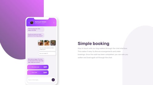
Chat app CSS illustration

Solution retrospective
I am proud of how the result turned out. If I would re-do this project, I would like to build it with other technologies.
What challenges did you encounter, and how did you overcome them?I always have a hard time figuring out background images. I find it hard to properly place them, and make them scale properly with the rest of the page. With this project the same thing. The background strokes are not responsive to my satisfaction. When I resize to a smaller screen, the strokes will be squiched. So that for me will be a point of improvement.
What specific areas of your project would you like help with?If any of you have any tips on how to do the background images properly, please let me know. I am struggling with this for a long time.
Please log in to post a comment
Log in with GitHubCommunity feedback
No feedback yet. Be the first to give feedback on Tom Roche's solution.
Join our Discord community
Join thousands of Frontend Mentor community members taking the challenges, sharing resources, helping each other, and chatting about all things front-end!
Join our Discord