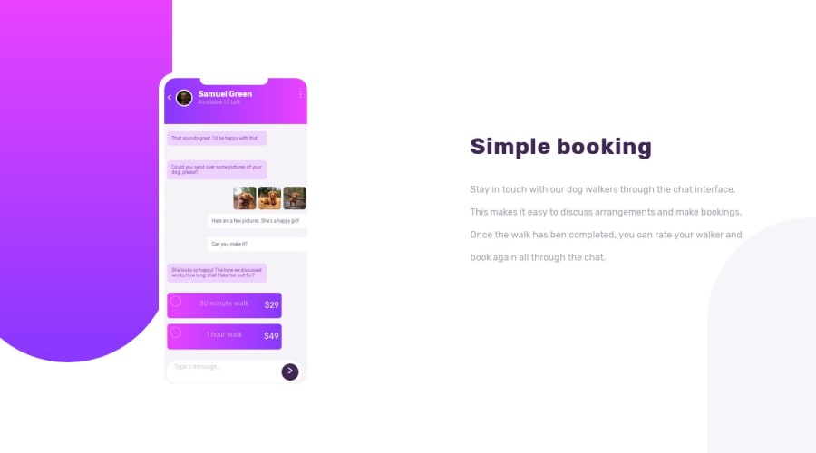
Design comparison
Solution retrospective
Always looking for ways to write cleaner and less bulky code, so keen to hear ways I can streamline parts of the projects or perfect the bits I haven't got exactly right. I'm also interested in how to better use ARIA for DIVS that don't really have a purpose.
Community feedback
- @kseniusPosted over 4 years ago
Hi!
- I don't think using
role="presentation"
on adiv
is the correct way to use this attribute. I myself never used it, but what I understood from what I googled about it is that it should be used on elements with semantic meaning to remove that meaning. So, it has no sense to use it ondiv
s.
Also, this attribute affects not only the element it's applied on, but the children of that element too, and you used this attribute on every
div
.In my opinion, the better solution to hide the chat app illustration from assistive technologies would be using
aria-hidden="true"
on the parent element (the element with.phone
class in your case).I recommend you take a look at this article (or the article on MDN) if you want to learn more about presentation role.
- I don't know how much experience you have with CSS, but your
.msg-user-two
class is weird. It's not easy to understand why all those properties is used. The positioning of the chat messages on the right and on the left could have been done with a few lines of flexbox, example below:
.message-exchange { /* your code... */ display: flex; flex-direction: column; } .msg-user-two { align-self: flex-end; }
Much simpler.
- You can build pixel perfect (or maximally close to that) solutions by using PerfectPixel extension for Chrome.
2@Augs0Posted over 4 years agoThanks for taking the time to comment. I'll take your suggestions on board and try to improve my code :) Thanks for that final recommendation. I have never heard of this extension before.
0@Augs0Posted over 4 years ago@ksenius Thanks again for your suggestions. I had another go and tried to implement some of your feedback. I haven't got it perfect for this challenge, but your feedback gave me a lot to think about and I still need to hone my skills on designing in a better, cleaner way. I'll take these lessons on to my next challenges :)
0 - I don't think using
Please log in to post a comment
Log in with GitHubJoin our Discord community
Join thousands of Frontend Mentor community members taking the challenges, sharing resources, helping each other, and chatting about all things front-end!
Join our Discord