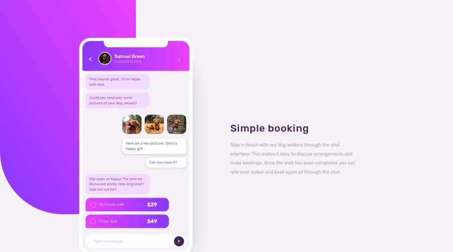
Design comparison
Solution retrospective
Hi everyone! Tried my hand at this challenge. Not sure if in the real world you actually build the phone design using CSS? I think creating the image using Photoshop will be a lot easier 😅 but I guess that's the challenge. Please take a look at my work and leave a comment! I'm sure there are many things I can improve. Thank you!
Community feedback
- @correlucasPosted about 2 years ago
Hey Charmonder! Its amazing to see how much you've improved since the first solution I saw. I can see that you're on your way to catch `em all! Keep it up! I can imagine how hard is this challenge and I'm looking forward to do it one day (I don't have idea the amount of divs to make the chat boxes hahah). Keep posting amazing content bro =)
1@charmonderPosted about 2 years ago@correlucas Hi Lucas! Thank you so much! I can't wait to be able to do more things with code :)
1@correlucasPosted about 2 years ago@charmonder I think you're already in a good level! I can't imagine how hard is this challenge, this is why I'm skipping the maximum I can hahaha. Have a nice day bro.
0 - @john-miragePosted about 2 years ago
Hello,
The brief challenges us to animate the chat interface, that's why it should be made in HTML & CSS.
Your users should be able to: - View the optimal layout for the component depending on their device's screen size - See the chat interface animate on the initial load (optional)
But you right, in real world, animated svgs is better than css in my opionion. You basically design your phone on a design app and export an svg. After, you just have to animate the svg paths.
1
Please log in to post a comment
Log in with GitHubJoin our Discord community
Join thousands of Frontend Mentor community members taking the challenges, sharing resources, helping each other, and chatting about all things front-end!
Join our Discord