Design comparison
Solution retrospective
Second challenge since my break and I felt like I was right back in it! I was able to spend most of the day studying and going over some of the formatting, sizing, and design basics.
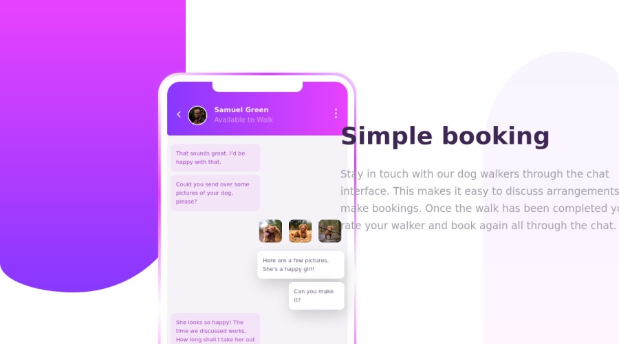
This challenge was a lot of fun because it has a certain simplicity to the web layout, but the challenge of designing a phone's messaging layout.
I remember when I first started I kept hearing all of the YouTube coders saying they spend most of their time googling how to do something or trying to find sources to base their code off of and I finally realized how helpful that could be. I utilized the resources I had and I believe I was learning better by doing that because I wasn't just making endless mistakes and getting frustrated that I couldn't figure things out on my own.
This is not going to be an exact copy of the example. I took creative liberties to improve as I saw fit.
If anybody sees anything funky in my code or spots something visually that just doesn't look right please please please let me know. At this point I'm getting comfortable making these challenges my own and would like to take the step into Java before long, so if there are glaring deficiencies now is definitely the time to catch them!
As always, thanks for the help and feedback!
Community feedback
- @reydelshitPosted over 3 years ago
cool bro. how did u do that infinite moving border broo?
0@agr227Posted over 3 years ago@reydelshit I found an example and followed it! Basically you create a background with a linear gradient that is larger than your parent element. From there you can add as many colors as you’d like. And then animate the background in an infinite linear loop. Check my GitHub for the exact code but I thought I was pretty neat!
0
Please log in to post a comment
Log in with GitHubJoin our Discord community
Join thousands of Frontend Mentor community members taking the challenges, sharing resources, helping each other, and chatting about all things front-end!
Join our Discord
