Design comparison
Solution retrospective
Hi,
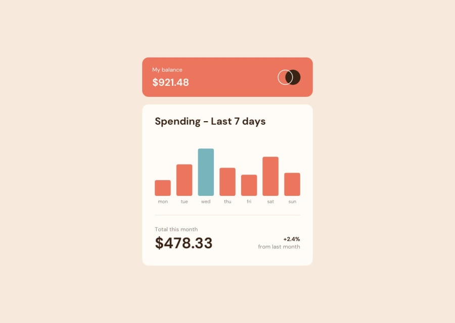
I tried to keep the layout as close as I could to the original.
Please let me know about any feedback.
Happy coding :)
Community feedback
- @aminetakdentiPosted about 2 years ago
and about the cyan color I think you should give it to the max value
0@dportillo23Posted about 2 years ago@aminetakdenti Thank you for your feedback. The challenge asked for:
See the current day's bar highlighted in a different colour to the other bars
That is why I used it to highlight the current day instead of max value
0 - @aminetakdentiPosted about 2 years ago
man you really did well, I really like the animation👌👌👌
0@dportillo23Posted about 2 years ago@aminetakdenti Thank you very much, Chart-js actually handles the animation by default, and it's very easy to setup, if you try this challenge, check that out
1
Please log in to post a comment
Log in with GitHubJoin our Discord community
Join thousands of Frontend Mentor community members taking the challenges, sharing resources, helping each other, and chatting about all things front-end!
Join our Discord
