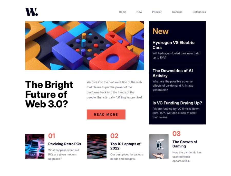
Change the layout Using window resize and media queries
Design comparison
Community feedback
- @Chriseden83Posted about 2 months ago
One thing that helped me when undertaking the project was using the HTML picture tag for two different images rather than javascript. You can set a min width of when it should change. The first source is when the picture should change along with the source as I planned for mobile first this was the desktop image, the fallback is the primary mobile image, see here:
 <picture>
          <source
            width="730"
            height="300"
            media="(min-width: 48em)"
            srcset="./assets/images/image-web-3-desktop.jpg"/>
          <img
            width="343"
            height="300"
            src="./assets/images/image-web-3-mobile.jpg"
            alt="hero image showing building blocks"
            class="feature__image" />
</picture>
Try adding a no scroll class on the body so you cannot scroll when the hamburger menu is open.
The layout starts to collapse into other elements around 760px so maybe try using the mobile / tablet version upto 700px and desktop after that?
I think you've done a good job, just a few things to look at for future projects
Marked as helpful0
Please log in to post a comment
Log in with GitHubJoin our Discord community
Join thousands of Frontend Mentor community members taking the challenges, sharing resources, helping each other, and chatting about all things front-end!
Join our Discord
