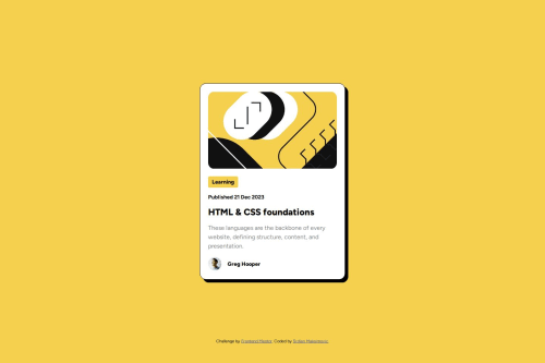
Challenge2 Blog Preview Card

Solution retrospective
I am proud of learning something new every day. Today I learned a new way of centering the element. I usually use flexbox, but this time I tried a different approach, using the code bellow:
div { position: absolute; top: 50%; left: 50%; transform: translate(-50%, -50%); }
What challenges did you encounter, and how did you overcome them?I was looking for a way to add some style to the parent div .container (make a bigger shadow) while hovering over a child element (h1 with text HTML & CSS foundations). If someone who is a beginner like me needs it, it is done by using this code on parent and child:
div.parent {
pointer-events: none;
}
div.child { pointer-events: auto; }
div.parent:hover { background: yellow; }
What specific areas of your project would you like help with?I appreciate every feedback you think would help me improve my design.
Please log in to post a comment
Log in with GitHubCommunity feedback
No feedback yet. Be the first to give feedback on SrkiMax's solution.
Join our Discord community
Join thousands of Frontend Mentor community members taking the challenges, sharing resources, helping each other, and chatting about all things front-end!
Join our Discord