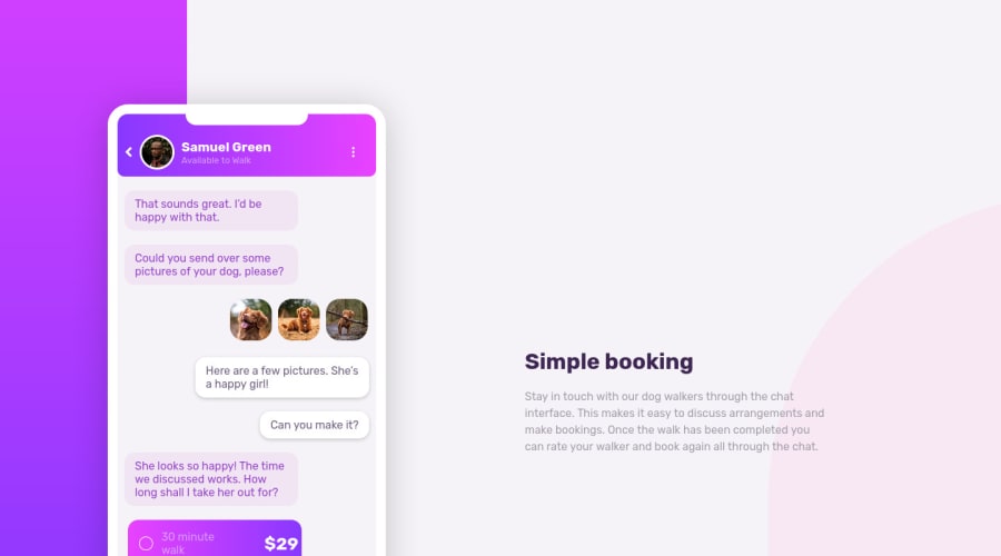
Design comparison
SolutionDesign
Community feedback
- @melwyntPosted over 3 years ago
Hi! That's pretty neat! In terms of responsiveness, it looks like the text on the right could benefit from a larger text area at breakpoint 991px. The space between the phone and the description could be smaller at that breakpoint.
There are some accessibility and html issues as shown in the report. Perhaps resolving them could lead to better SEO.
Other than that it's a great job! 🙌
Marked as helpful1
Please log in to post a comment
Log in with GitHubJoin our Discord community
Join thousands of Frontend Mentor community members taking the challenges, sharing resources, helping each other, and chatting about all things front-end!
Join our Discord
