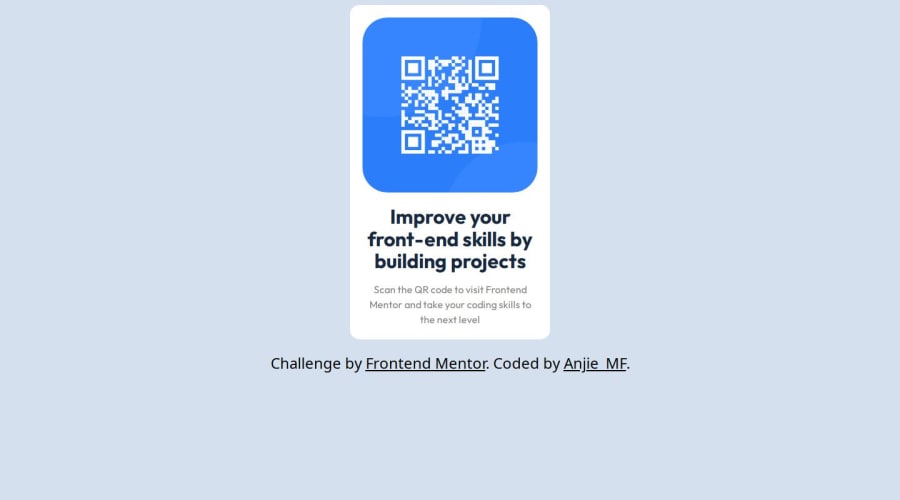
Design comparison
Solution retrospective
I am proud to learn that sometimes the simplest solution is the solution. Not to overcomplicate!
What challenges did you encounter, and how did you overcome them?I had difficulty understanding the significance of HTML5 semantics, so I saved a website with a range of semantic cheat sheets.
What specific areas of your project would you like help with?The project was simple. I struggled with throwing everything but the kitchen sink in it.
Community feedback
- P@danielmrz-devPosted about 1 year ago
Hello @Anjie-MF!
Your project looks great!
I noticed that you used
marginto place the card in the middle of the page. Here's a very efficient (and better) way to center the card:- Apply this to the body (in order to work properly, don't use position or margins):
body {
    min-height: 100vh;
    display: flex;
    justify-content: center;
    align-items: center;
}
I hope it helps!
Other than that, great job!
Marked as helpful0P@Anjie-MFPosted about 1 year agoThank you. I didn't know what else to do so I genuinely appreciate the feedback. I will update my code later tonight @danielmrz-dev
0
Please log in to post a comment
Log in with GitHubJoin our Discord community
Join thousands of Frontend Mentor community members taking the challenges, sharing resources, helping each other, and chatting about all things front-end!
Join our Discord
