

Design comparison
SolutionDesign

Solution retrospective
What are you most proud of, and what would you do differently next time?
It looks pretty similar.
What challenges did you encounter, and how did you overcome them?The biggest challenge is to get started here and fill all of this stuff.
Community feedback
- P@dev-ethanjohnPosted about 1 month ago
Great work friend! Given that this is a first challenge, it is good to see you've taken the steps to replicate the design.
Well, the use of
rooton CSS made sure properties inside it are reusable.There are some improvement that I suggest you may look into or consider.
- You can explore more cases to where you can use native semantic tags instead of relying solely on your classes or attributes on your divs. For example, you can use
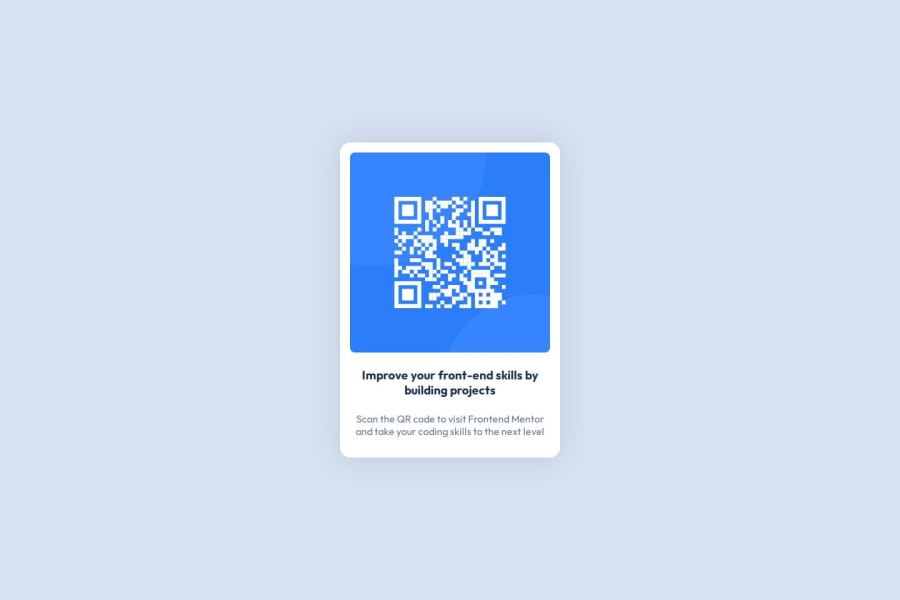
articleas a parent container and some div inside for styling. Or afigureelement to wrap your qr image. - Have an external CSS, this way we can have separation. Though given the little amount of content in this project, internal CSS will be fine.
- Take a look on some default properties you can implement to make your css styling consistent. For example, setting your
paddingto 0 andbox-sizingtoborder-boxon the* {}universal selector ensures you have more control over your styling and gives you consistent behavior across your elements. - It would be better if you could follow almost all the design values of the sample mockup. For instance, your Card component has more width (due to by not setting box-sizing to border-box). You use h3 for the main text, but remember heading texts are semantics, and since this is standalone component, having
h1as your primary text is more acceptable approach.h3is fine as long as the component is a child of the larger parent that holds already theh1andh2tags. From the design on Figma, there are also specific values for font-sizes, letter-spacing and so forth, you may check them out you can know exactly what to style. - To allow layout flexibility, you can wrap your heading, and paragraph to a new
divseparating it from the image; and there use flexbox or grid for spacing and alignment.
Hope it helps mate!
Marked as helpful0 - You can explore more cases to where you can use native semantic tags instead of relying solely on your classes or attributes on your divs. For example, you can use

Please log in to post a comment
Log in with GitHubJoin our Discord community
Join thousands of Frontend Mentor community members taking the challenges, sharing resources, helping each other, and chatting about all things front-end!
Join our Discord