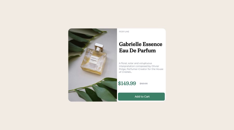


Design comparison

Solution retrospective
Hello ! Here is my second challenge and I am very proud of the result despite the time spent and after doing some research. Now it is your turn to help me since I would like to have some feedback on the project. How can I improve? What good can I add to make the code more readable and consistent and make the site nice to see
Community feedback
- @devsotterPosted over 1 year ago
Hi, taking a quick look I noticed a few things that can make your code more consistent. You can use shorthands to group and set multiple related properties with a more concise syntax. For example, instead of using separate properties like 'border-radius top right: 20px;' and 'border-bottom-right-radius: 20px;', you can just use 'border-radius: 0 20px 0 20px;' to get the same result.The same principle applies to the 'background-image' properties in your code, among others.
Also, instead of employing a media query to adjust the content for mobile screens as you did when converting 'flex-direction: row' to 'flex-direction: column', you can simply add 'flex-wrap: wrap; ' for the '.product' class. This will allow the content to be split into columns correctly. Keep up the great work!
Marked as helpful1 - @Okemwa-mokayaPosted over 1 year ago
For product-price since it is a crossed off price you are advised to use <del></del>,you can google to confirm. for product-category CSS does not advise to use capital letters through for PERFUME you could write in small letters in html then in CSS use text-transform and set to uppercase Hope this is helpful
Marked as helpful0


Please log in to post a comment
Log in with GitHub
Join our Discord community
Join thousands of Frontend Mentor community members taking the challenges, sharing resources, helping each other, and chatting about all things front-end!
Join our Discord