Design comparison
SolutionDesign
Solution retrospective
setting padding>>>setting heights
Community feedback
- @danielmrz-devPosted 11 months ago
Hello @uhmeer!
Your solution looks great!
I have one suggestion:
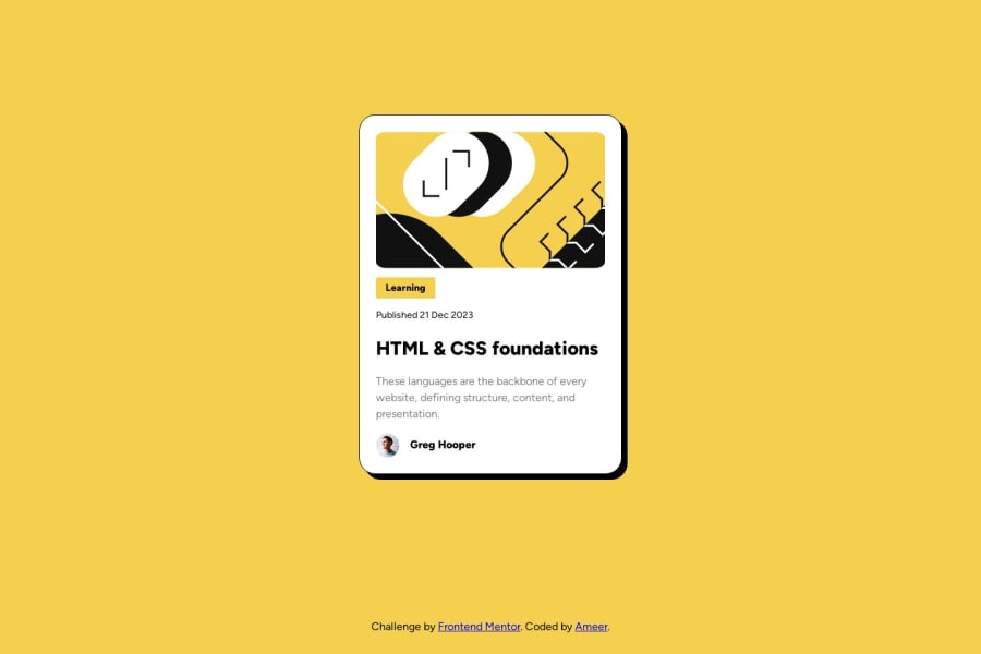
- Since you set grid to the body, but you didn't set the size of the rows, your footer is pushing your card up a little bit. You can prevent that from happening adding this to the body:
grid-template-rows: 90% 1fr;Then your card will always occupy 90% of the space and the footer will adapt in the remaining space.
I hope it helps!
Marked as helpful1@uhmeerPosted 11 months ago@danielmrz-dev Thank you for this!! I was really struggling with trying to get that last div in check.
1
Please log in to post a comment
Log in with GitHubJoin our Discord community
Join thousands of Frontend Mentor community members taking the challenges, sharing resources, helping each other, and chatting about all things front-end!
Join our Discord
