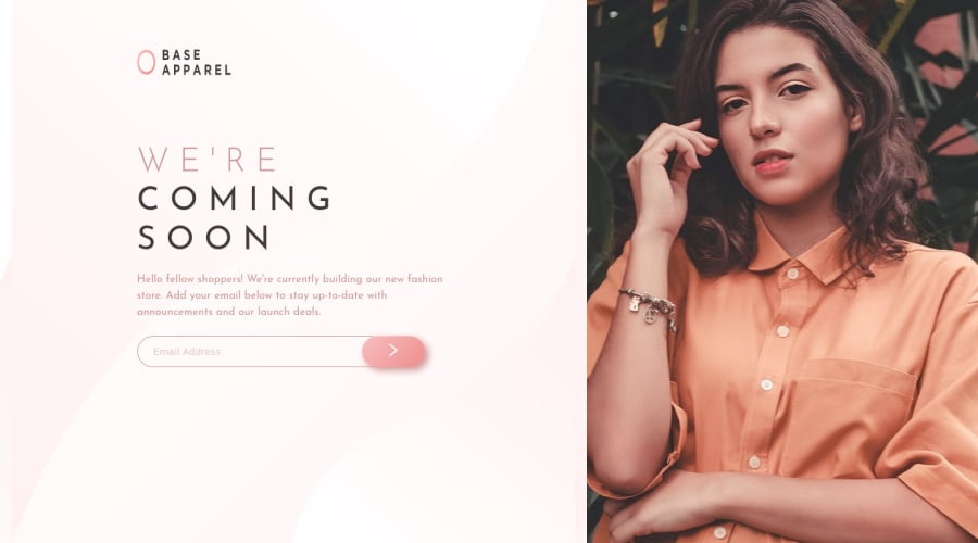
Design comparison
Solution retrospective
all suggestions and feedback are welcome.
Community feedback
- @AgataLiberskaPosted over 3 years ago
Hi @blueSkyRocket!
-
Whenever you use position: absolute, make sure to set position property on the parent (that's the form) as well - it needs to be anything but the default (which is static).
-
I think the button resizes because the error icon in mobile is set to position: relative. This means that other elements take notice of it and move around to make space for it (in this case, the parent element is the form and that set to display: flex, so the children will resize to fit everything in). If you change it to position: absolute (and make sure that parent is position: relative), other elements will ignore it and not resize.
Marked as helpful1 -
Please log in to post a comment
Log in with GitHubJoin our Discord community
Join thousands of Frontend Mentor community members taking the challenges, sharing resources, helping each other, and chatting about all things front-end!
Join our Discord
