Submitted 4 months ago
Challenge about create a Product preview card HTML CSS SASS
#sass/scss

@apradaglez

Design comparison
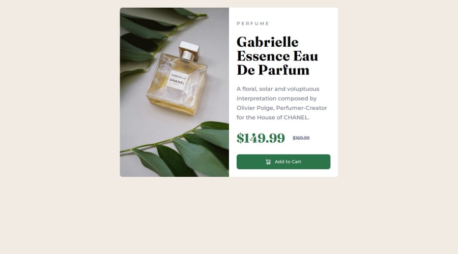
SolutionDesign

Solution retrospective
What are you most proud of, and what would you do differently next time?
Happy that I am able to code this challenge with Sass. The next time I will try to improve the structure with sass and code.
What challenges did you encounter, and how did you overcome them?I've fought with the Responsive Design, specifically with the Responsive images and sizes of the container, Too with the function "clamp" I've fought but I couldn't achieve that it works and I've Found an alternative way. I admit to suggestions to improve my code.
What specific areas of your project would you like help with?With funtion "Clamp" and use mediaqueries with sass
Community feedback
Please log in to post a comment
Log in with GitHub
Join our Discord community
Join thousands of Frontend Mentor community members taking the challenges, sharing resources, helping each other, and chatting about all things front-end!
Join our Discord