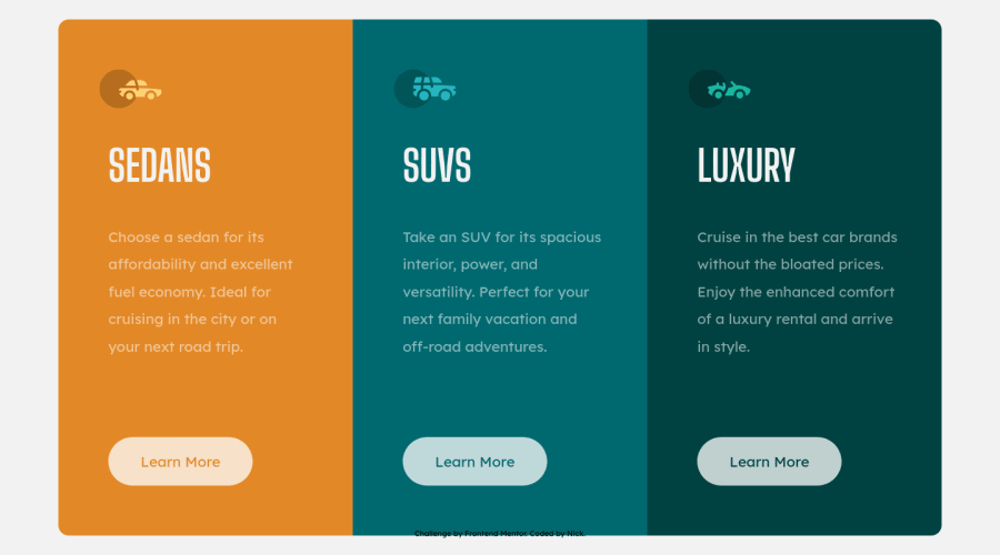
Design comparison
Solution retrospective
More good practice.. Looking for input!
Updated RE footer & <a>
Community feedback
- @AdrianoEscarabotePosted about 2 years ago
Hi Nicholas Nall, how are you?
I really liked the result of your project, but I have some tips that I think you will enjoy:
To improve the code structure, wrap this div:
<div class="attribution">
    Challenge by <a href="https://www.frontendmentor.io?ref=challenge" target="_blank">Frontend Mentor</a>.
    Coded by <a href="#">Nick</a>.
</div>
with the semantic tag
footer.change the
buttontag to anatag, taking into account that the button isLearn more, I imagine this is not a form, or something like that, this button would probably take us to another page, read more about! so I think theatag is the best choice in this case!The rest is great!
I hope it helps... 👍
Marked as helpful1 - @j-tomajinPosted about 2 years ago
Hello!
tips for attribution,
-
you may wrapped it inside a footer element
-
for it to be stick at the bottom you can:
body {
   position: relative;
   min-height: 100vh;
}

footer {
   position: absolute;
   bottom: 0;
   left: 0;
   right: 0;
}
HAPPY CODING!
Marked as helpful0 -
Please log in to post a comment
Log in with GitHubJoin our Discord community
Join thousands of Frontend Mentor community members taking the challenges, sharing resources, helping each other, and chatting about all things front-end!
Join our Discord
