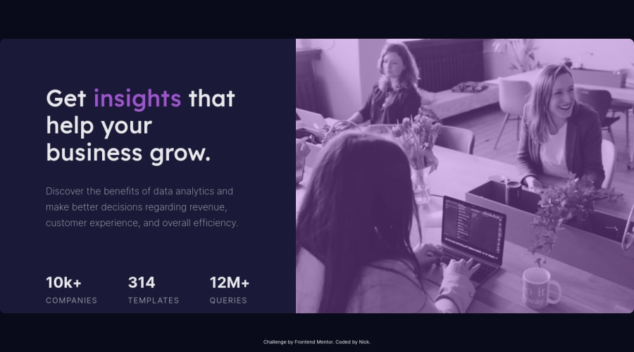
Challenge 3 (UPDATED): Stats Preview Component (mobile-friendly)
Design comparison
Solution retrospective
Still Mobile Friendly, v3 fixed the attribution links, adjusted mobile container img
Community feedback
- @VCaramesPosted about 2 years ago
Hey there! 👋 Here are some suggestions to help improve your code:
-
The statistics component is a list of statistics, so it should be built using an Unordered List along with a List Items Element.
-
The image serve no other purpose than to be decorative; It adds no value. The Alt Tag should left blank and have an aria-hidden=“true” to hides it from assistive technology.
-
This challenges requires the use of two images 🎑 for different breakpoints. The Picture Element will facilitate this.
Here is an example of how it works: EXAMPLE
Syntax:
  <picture>
    <source media="(min-width: )" srcset="">
    <img src="" alt="">
  </picture>
More Info:
https://www.w3schools.com/html/html_images_picture.asp
https://web.dev/learn/design/picture-element/
- To get the image to look like the FEM example, you are going to want to use the
Mix-Blend-Modealong with theMultiplyvalue and include aOpacitywith the value of 0.8.
Code:
img {
  opacity: 0.8;
  mix-blend-mode: multiply;

}
If you have any questions or need further clarification, feel free to reach out to me.
Happy Coding! 🍂🦃
0@nnallPosted about 2 years ago@vcarames
Thank you for the feedback.. I've updated the code with what you've said.
The stats section was changed to <ul>,
the <picture> element now houses the <img>, although I'm not sure I've implemented it correctly since it never seems to change the image source, still only just using the image I had been using, which is inside <picture> as my "default'" <img>. So idk why its not changing to the other listed image at the breakpoint (max-width: 1200px);
0@VCaramesPosted about 2 years ago@nnall
You currently have two
sourceimages. You only need onesourceand oneimagein order for it to work. The change is occurring but since there are two differentsourceonemin-widthand the othermax-width, the browser is getting confused.0@nnallPosted about 2 years ago@vcarames
One image, even though I want it to use a different '-mobile.png' image below 1200px?
0@VCaramesPosted about 2 years ago@nnall
The
sourceimage is the secondary image (in your case, since you built it desktop first, the mobile image will go here)For the
imgthis is for the default image, that also serves as a back-up (so here you would place the desktop image)So your code should look like this.
<picture>
        <source media="(max-width:1200px)" srcset="images/image-header-mobile.png">
        <img src="images/image-header-desktop.png" alt="" aria-hidden="true">
  </picture>
The only reasons you would have more
sourceimages is if they have different contrast (for a dark theme) or are using a different format.Marked as helpful0@nnallPosted about 2 years ago@vcarames
Is there a way to see which image the <picture> element is actually using?
0@VCaramesPosted about 2 years ago@nnall
For this challenge is kinda difficult to tell since the images are very similar. But when the mobile screen shows, it should have a longer width and the image's focus will be more on the perfume bottle.
You can practice by using random images to see it in action and once you know how it works use the FEM images.
1 -
Please log in to post a comment
Log in with GitHubJoin our Discord community
Join thousands of Frontend Mentor community members taking the challenges, sharing resources, helping each other, and chatting about all things front-end!
Join our Discord
