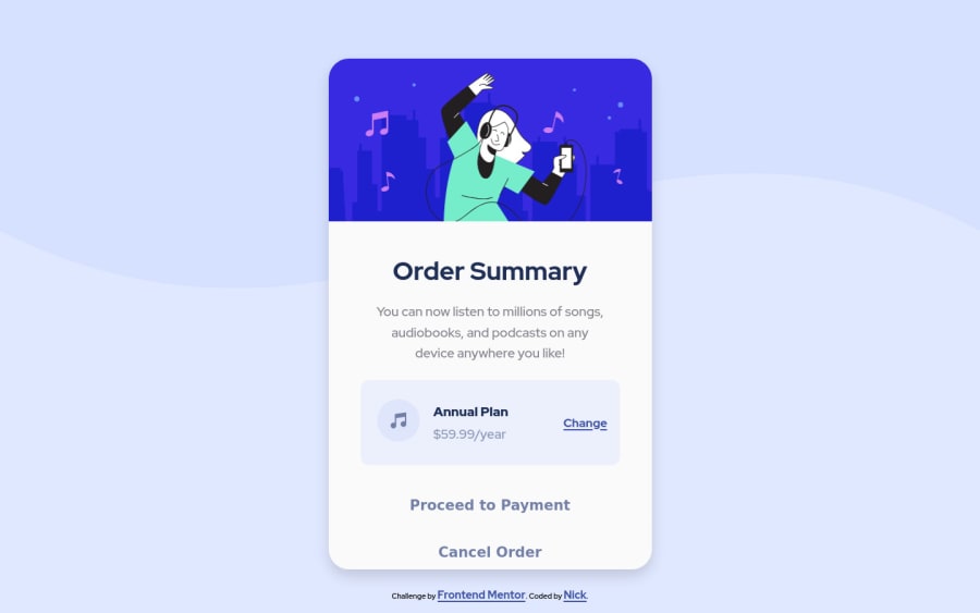
Challenge 2 Order Summary Component (v2)
Design comparison
Solution retrospective
Looking for any feedback on updated Challenge 2!
Community feedback
- @AdrianoEscarabotePosted about 2 years ago
Hi Nicholas Nall, how are you?
I really liked the result of your project, but I have some tips that I think you will enjoy:
As you know this project is based only on one page component, so no h1 is needed! because we don't know if this page will have a more important component, but it's always good to prevent accessibility errors so I think it would be good for you to add an
h1in this component, besides being a good practice for when you are developing larger sites, don't worry forget abouth1.avoid trying to center the content with margin or padding, prefer to use flexbox or grid, like this:
body {
    display: flex;
    align-items: center;
    justify-content: center;
    min height: 100vh;
}
The rest is great!
I hope it helps... 👍
1@nnallPosted about 2 years ago@AdrianoEscarabote
Thank you Adriano! After getting some advice from my last challenge I"m going to soon replace this version, h1 was an error there too.
1
Please log in to post a comment
Log in with GitHubJoin our Discord community
Join thousands of Frontend Mentor community members taking the challenges, sharing resources, helping each other, and chatting about all things front-end!
Join our Discord
