Design comparison
Community feedback
- @Kira-SannPosted almost 2 years ago
vi que você não fez o efeito de hover nos botões para fazer isso e simples você só precisa adicionar
:hoverno que quiser alterar olha o exemplo abaixoinicialmente a cor do botao e preta
button {color: black;}mas adicionando o Pseudo-elemento hover ao botão quando o mouse pasar em cima do elemento a cor dele vai mudar para vermelha
button:hover {color: red;}também esta faltando a versão mobile para isso você pode usar a chamada media query basta usar
media screen and (max-width: (screen size for changes to start working, ex:600px)px) {Marked as helpful1 - @hikkenoace1Posted almost 2 years ago
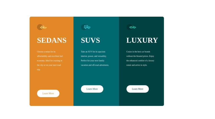
why does the font of the heading doesn't look like what i made in the original code
0P@CarlHummPosted almost 2 years ago@hikkenoace1
- You have
font-family: big shoulders display thin - That font is not linked in the head or downloaded and imported in your stylesheet using
@font-face.
The reason it looks fine locally is because you've probably downloaded that font from google as a Zip file and installed it locally. But for it to work online you need to link to it to provide a reference for computers without it downloaded.
Instead of clicking on 'download family' on google fonts, you can select individual fonts and it will bring up a sidebar with pre-generated code to link in head, or import in stylesheet
Marked as helpful1 - You have
Please log in to post a comment
Log in with GitHubJoin our Discord community
Join thousands of Frontend Mentor community members taking the challenges, sharing resources, helping each other, and chatting about all things front-end!
Join our Discord
