Design comparison
Solution retrospective
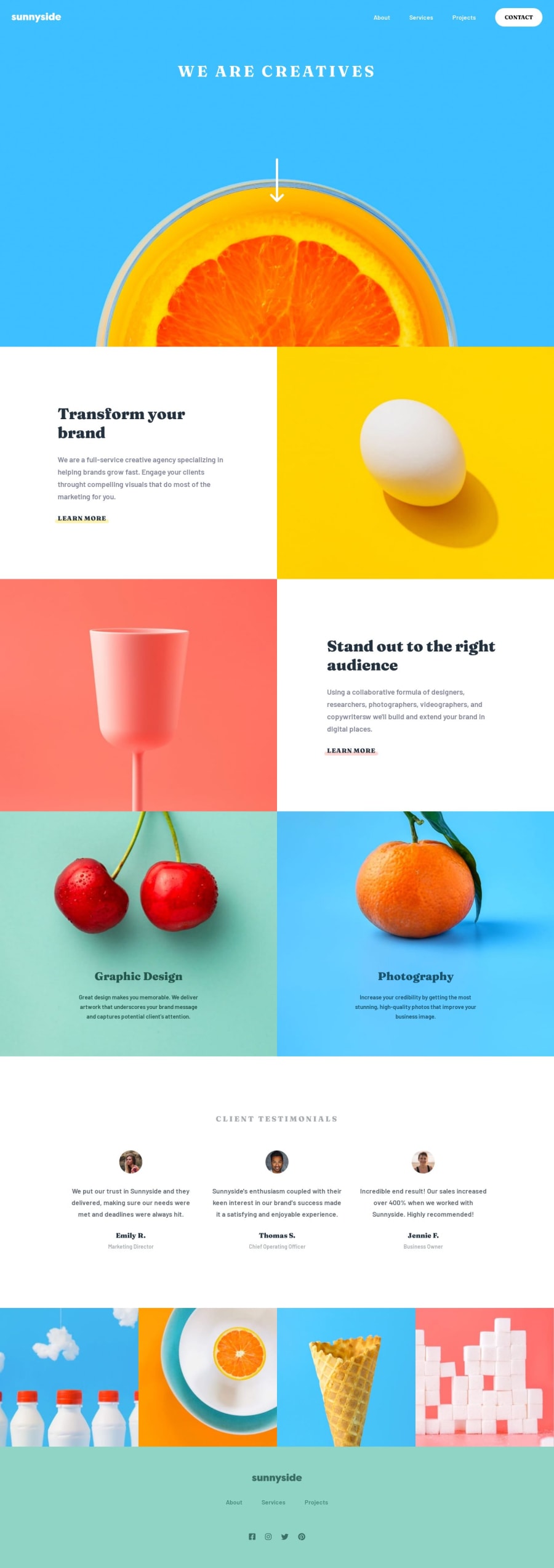
Hello, this is my solution for this project. I don't know why the Frontend Mentor icon doesn't work, the way is good. I had some problems with the navList transition in responsive so don't be too fast when you resize the screen lol. Have a good weekend !
Community feedback
- @adityaphasuPosted over 1 year ago
Hello, @AlexDDevv~
- The reason why the favicon doesn't work is because you forgot to put a
/before the assets in thehrefxD - To fix it just add the
/before the assets like this:
href="./assets/images/favicon-32x32.png"Just a quick fix for the images stretching out in mobile view, remove the explicit height from the
.section-imgdiv:main .section-img { height: 300px; //remove this we don't need it }- Instead you can just add a global style for all the images like this:
img {
    max-width: 100%;
    height: auto;
    display: block;
}
This way the image won't stretch and you won't need to explicitly set heights on the divs because while setting heights is okay in this case the images start to stretch to fit the height specified.
Apart from this small fix, everything looks good! I don't think the navlist would be an issue since there's a transition on it we get that glitched-out thingy when we stimulate the screen sizes in devtools. It should look fine for mobile devices.
Keep up the hard work and happy coding!🙌🏻
0 - The reason why the favicon doesn't work is because you forgot to put a
Please log in to post a comment
Log in with GitHubJoin our Discord community
Join thousands of Frontend Mentor community members taking the challenges, sharing resources, helping each other, and chatting about all things front-end!
Join our Discord
