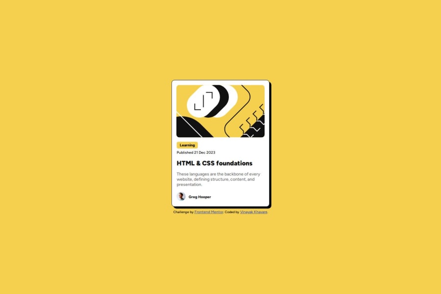


Design comparison

Community feedback
- P@StroudyPosted 6 months ago
Exceptional work! You’re showing great skill here. I’ve got a couple of minor suggestions that could make this stand out even more…
- This does not need a role main if the HTML tag is already a main,
<main role="main">- Overusing
<div>tags, known as "divitis," leads to cluttered code, poor semantics, and reduced performance. Instead, use appropriate semantic elements (like<header>,<section>, etc.) to improve readability, accessibility, and SEO. Keep HTML clean and minimal to ensure maintainability, scalability, and better CSS structure.
<div class="img-container"> <img src="assets/images/illustration-article.svg" alt="Article Logo" class="article-logo"> </div>- These
<span>should really have semantic tags like headings (<h1> to <h6>) and paragraphs (<p>) convey structure and meaning to content, improving accessibility, SEO, and readability by helping search engines and screen readers interpret the content.
<span class="learning">Learning</span>-
Using a full modern CSS reset is beneficial because it removes default browser styling, creating a consistent starting point for your design across all browsers. It helps avoid unexpected layout issues and makes your styles more predictable, ensuring a uniform appearance on different devices and platforms, check out this site for a Full modern reset
-
While
pxis useful for precise, fixed sizing, such asborder-width,border-radius,inline-padding, and<img>sizes, it has limitations. Pixels don't scale well with user settings or adapt to different devices, which can negatively impact accessibility and responsiveness. For example, usingpxfor font sizes can make text harder to read on some screens, Check this article why font-size must NEVER be in pixels. In contrast, relative units likeremand adjust based on the user’s preferences and device settings, making your design more flexible and accessible. Usepxwhere exact sizing is needed, but prefer relative units for scalable layouts. If you want a deeper explanation watch this video by Kevin Powell CSS em and rem explained. Another great resource I found useful is this px to rem converter based on the default font-size of 16 pixel.
I hope you’re finding this guidance useful! Keep refining your skills and tackling new challenges with confidence. You’re making great progress—stay motivated and keep coding with enthusiasm! 💻
Marked as helpful1@Vinayak-KhavarePosted 6 months agoThanks for your suggestions. I'll work on these and hopefully you'll like my next solution. Thanks @Stroudy
0P@StroudyPosted 6 months agoHey @Vinayak-Khavare, No problem, You could easily make some of these changes on this solution, I wouldn't use the full reset tho as this will probably break some of your elements but for the next challenge start with a full reset for sure. You got this bro!
1

Please log in to post a comment
Log in with GitHub
Join our Discord community
Join thousands of Frontend Mentor community members taking the challenges, sharing resources, helping each other, and chatting about all things front-end!
Join our Discord