Submitted 10 months ago
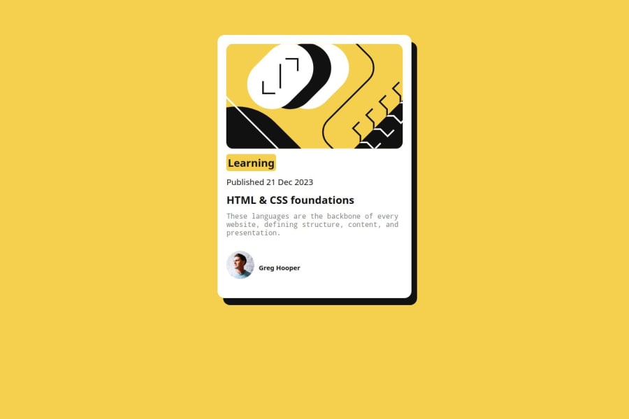
centering using flex-box in css
#pure-css
@abdul-busybrain
Design comparison
SolutionDesign
Solution retrospective
What are you most proud of, and what would you do differently next time?
Using display flex to center an item.
What challenges did you encounter, and how did you overcome them?Turning the project to mobile took me more than an hour to tweak less than 10 lines of css code
What specific areas of your project would you like help with?naming of classess
Community feedback
- @SJGit15Posted 10 months ago
This layout looks good on desktop. Some changes could be made to this project such as the font size of "learning" and the font weight of "greg hooper"
Marked as helpful0@abdul-busybrainPosted 10 months ago@SJGit15 thank you very much i will work on that
0
Please log in to post a comment
Log in with GitHubJoin our Discord community
Join thousands of Frontend Mentor community members taking the challenges, sharing resources, helping each other, and chatting about all things front-end!
Join our Discord
