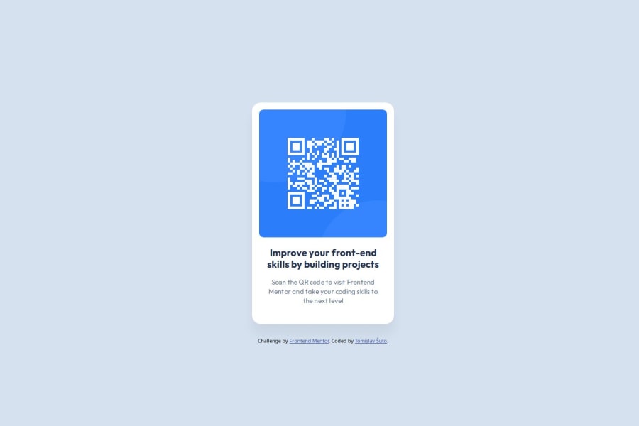
Design comparison
Solution retrospective
I am just proud I managed to match the design :)
What challenges did you encounter, and how did you overcome them?There were some little challenges like working with Git, nothing to write home about.
What specific areas of your project would you like help with?Although the project was simple to do, centering an element vertically and horizontally seems to be more complicated than it should. Using flex
is possible (I think), but I decided to use positioning:
.container { position: absolute; top: 50%; left: 50%; -ms-transform: translate(-50%, -50%); transform: translate(-50%, -50%); }
I understand the transform
property, but I don't understand what is -ms-transform
property supposed to be and what does it do. If anyone has an answer or has a link with a good explanation, I am happy to devour it :)
Community feedback
- @jasper2virtualPosted 3 days ago
Although translate and absolute positioning can get the job done, but this is the technique decades ago. In modern css, flex and grid are the better tools when you try to build the structure of layout.
Positioning and translation is still useful today, depending on the use case. One example is building the dynamic widget on screen.
Marked as helpful1@RetroApePosted 3 days ago@jasper2virtual Thank you Lai Yiu Leung for your precious input.
I edited the code with
flex
in mind and positioned it better than it was before.I will be using
flex
andgrid
from now on.0 - @evertznerPosted 3 days ago
Hi, nice job!
The -ms- is a vendor prefix, this allows developers to change browser configurations to test upcoming features. Browsers now add experimental features behind user-controlled flags or preferences. Flags can be added for smaller specifications enabling reaching a stable state much more quickly.
Those prefixes are:
- -webkit- (Chrome, Safari, newer versions of Opera and Edge, almost all iOS browsers including Firefox for iOS; basically, any WebKit or Chromium-based browser)
- -moz- (Firefox)
- -o- (old pre-WebKit versions of Opera)
- -ms- (Internet Explorer and Microsoft Edge, before Chromium)
In my opinion, you should try to strengthen your
flex
andgrid
skills. It will let you do incredible things!Marked as helpful1@RetroApePosted 3 days ago@evertzner Thank you Esteban for taking the time to answer my query.
I took the chance to edit the code with
flex
in mind, usingbody
as a container, even though I shouldn't have done that (I think). I also positioned the Card directly in the center, so it is easier to judge the Solution and the Design difference.I will be using
flex
andgrid
from now on.0
Please log in to post a comment
Log in with GitHubJoin our Discord community
Join thousands of Frontend Mentor community members taking the challenges, sharing resources, helping each other, and chatting about all things front-end!
Join our Discord