Submitted over 1 year agoA solution to the QR code component challenge
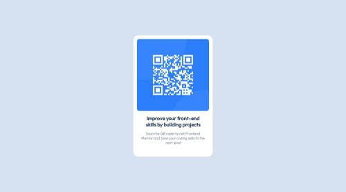
Centered QR Code Card
@nickdexter

Solution retrospective
What are you most proud of, and what would you do differently next time?
I'm proud to have finished my first challenge!
If I was to do this again I would at alternate ways to center the card.
What challenges did you encounter, and how did you overcome them?I had some trouble centering the card vertically but I managed to overcome it in the end by using top, left, and transform.
What specific areas of your project would you like help with?I couldn't seem to get the font looking quite the same. I'm guessing this has something to do with a combination of font size and font weight.
Code
Loading...
Please log in to post a comment
Log in with GitHubCommunity feedback
No feedback yet. Be the first to give feedback on Nick Dexter's solution.
Join our Discord community
Join thousands of Frontend Mentor community members taking the challenges, sharing resources, helping each other, and chatting about all things front-end!
Join our Discord