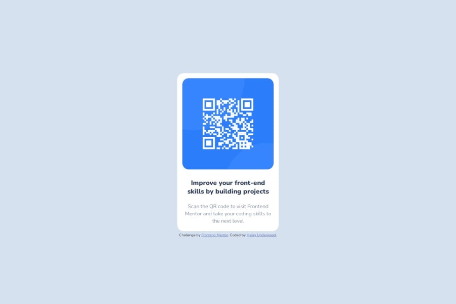
Design comparison
Solution retrospective
I'm proud of my ability to recall so much of the process after several years of not coding.
Next time, I'll try to keep my screen more organized with fewer tabs, so clutter doesn't add on to the stress of learning so many new programs.
What challenges did you encounter, and how did you overcome them?I struggled initially with figuring out how to vertically center the main content box, but was able to do so using flex boxes
What specific areas of your project would you like help with?I'd love to know if there's any areas where I potentially added an extra step or skipped something crucial, or if there was anything I could do to simplify my code.
Community feedback
- @KapteynUniversePosted about 17 hours ago
Hey underhr, nice job. It is good visually but i have recommendations for the foundation.
It's important to make sure that your website is accessible to all users, including those using assistive technologies such as screen readers.
For that, i recommend you to use more semantic elements:
First, landmarks, (or this page). Every page needs one main. Wrapping your content box or changing the div with a main would be good. Since this would be a single element around others and not the whole content of a real page, wrapping might be better.
Image alt texts needs to be meaningful, unless decorative. Right now a screen reader only sees the qr code img as "image" + "QR code". "QR code to frontendmentor.io" might be better
Span is mostly to style differently a part of the text as far as i know. There are over 100 html tags. I would use h2/h3(for the same reason of this card won't be a single element on a real page and that real page will have a h1 already. Just for good practice, it is ok to use h1 here) and p tag for the texts. You can even wrap them or change text div with a hgroup i guess.
Break rules are bad, i am not sure if there is a usage for br besides poetry. For spacing; use margin, padding or gap if you used flex or grid.
For better responsiveness; use rem and max-min values.
max-width: 20rem;
for thewidth: 320px;
in your content div for example. You don't need to set height most of the times but i guess you did to put the footer out of the card. Visually it doesn't matter for this challenge but generally we don't want overflow.margin: auto;
on the content div is ok but since you used flex on the body, you could usejustify-content: center;
on the body for horizontally centering the card aswell. No difference for this project, just might help to readability.I see you mixed ids and classes. Use classes instead of ids. Ids must be unique to one item, so you can't use same style on different places with id. Also ids have better priority, so it might cause issues later.
You can apply font family to the body and change on the element that needs another font family. Almost every element will inherit the font family from body.
And for that elements that do not inherit the font family and for other nice things, i recommend you to use a modern css reset for every project. You can check Andy Bells reset too.
Lastly adding
font-display: swap;
to the @font-face might be good too. I don't know much about fonts but i think that tells to the browser use default font before downloading the custom font so page won't flash during loading. Again just a good practice, it probably won't matter for the challenges here if someone is not connecting with 256 kbps internet.0
Please log in to post a comment
Log in with GitHubJoin our Discord community
Join thousands of Frontend Mentor community members taking the challenges, sharing resources, helping each other, and chatting about all things front-end!
Join our Discord