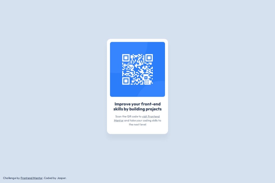
Design comparison
SolutionDesign
Community feedback
- @MUFTIATBAKAREPosted 8 months ago
This is a very good attempt. The solution is accessible and it includes semantic HTML. It looks good on a range of screen sizes. It's a bit different from the design, the main-padding:2em makes the solution look different from the design on smaller screen..
0
Please log in to post a comment
Log in with GitHubJoin our Discord community
Join thousands of Frontend Mentor community members taking the challenges, sharing resources, helping each other, and chatting about all things front-end!
Join our Discord
