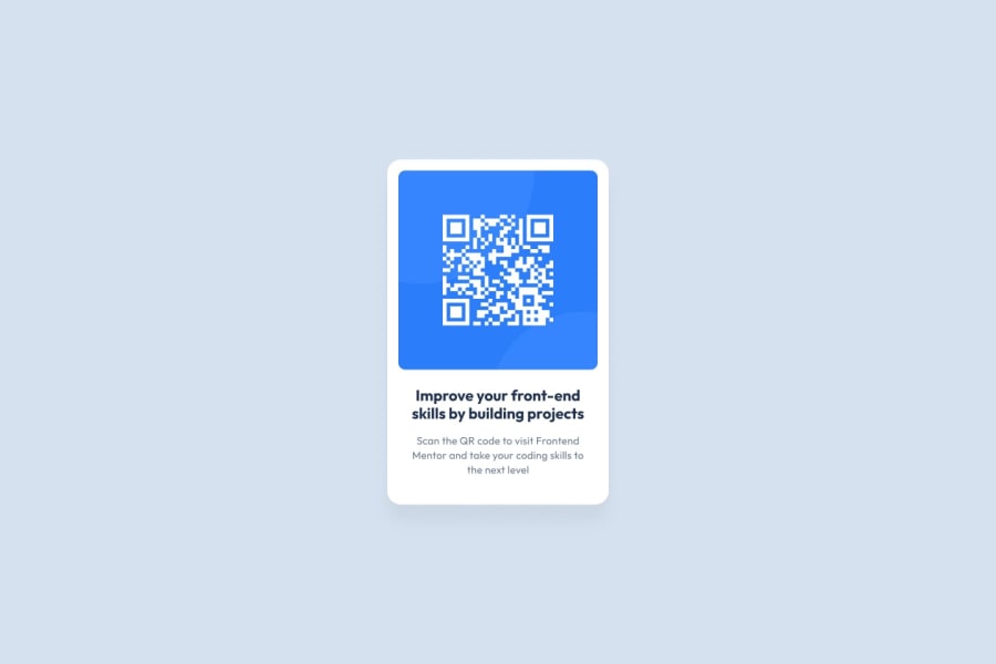
Design comparison
SolutionDesign
Community feedback
- @JordanMartinWebDevPosted over 1 year ago
The bottom text has a color that is mentioned in the file download. Looks like you missed that. Also, the bottom text doesn't quite look like the example in your solution. In mine I used the width css attribute to make both the <h2> and <p> slight smaller than the QR code image. That kept the card text from looking so boxy and fixed the text alignment to meet the example.
0
Please log in to post a comment
Log in with GitHubJoin our Discord community
Join thousands of Frontend Mentor community members taking the challenges, sharing resources, helping each other, and chatting about all things front-end!
Join our Discord
