Design comparison
Community feedback
- Account deleted
Hey there! 👋 Here are some suggestions to help improve your code:
-
To help identify the main content of you site you will want to encase your entire component inside a Main Element.
-
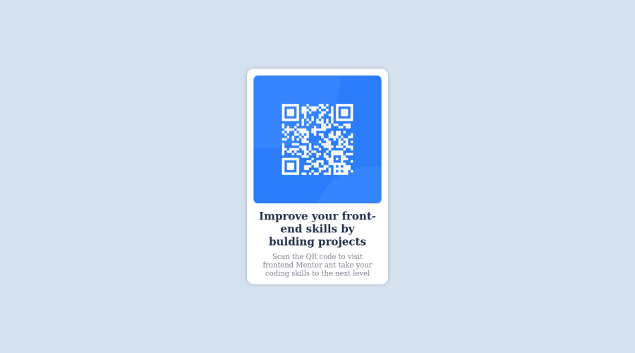
The Alt Tag description for the QR image needs to be improved upon. Its needs to tell screen reader users what it is and where it will take them to when they scan it.
-
Change
widthtomax-widthin your component’s container to make it responsive. You will also want to remove theheightas it is unnecessary.
If you have any questions or need further clarification, let me know.
Happy Coding! 👻🎃
Marked as helpful1 -
Please log in to post a comment
Log in with GitHubJoin our Discord community
Join thousands of Frontend Mentor community members taking the challenges, sharing resources, helping each other, and chatting about all things front-end!
Join our Discord
