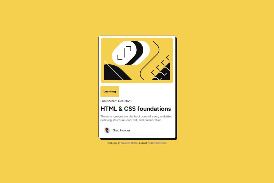
Design comparison
Solution retrospective
I have decided not to use any frameworks such as Bootstrap or Tailwinds
Instead of trying to design it from scratch, I used the Figma designs this time, which made the experience a whole lot better.
Just from the past two challenges I feel like by doing rather than tutorial hell, I have learned actual concepts and techniques rather than just following along
What challenges did you encounter, and how did you overcome them?I found it difficult to know if all my need to be displayed: flex. It looks like the Figma designs, but I'm not sure if that's correct.
I'm still finding it hard to figure out the units for sizing. Should the view be 100vh or set a px value? When and how to set width/height for elements... I'm sure I just need some more practice
I would like to know how you decide what divs need to be flexboxes and how you decide and what units you use to create the widths and heights or do you just add margins and let the parent decide the size of the child?
Community feedback
- P@Yakub357Posted 8 months ago
Dear Adam Bethlehem, You may add some padding inside div container which cover-up the texts or add some margin to your text. both for titles (h1)and for P-text. Also there is small discrepancy between the design color of secondary text, p-text and the solution, you may change the color property
Marked as helpful0@adambethPosted 8 months ago@Yakub357 Thank you so much for the feedback. I will try to implement that now!
0
Please log in to post a comment
Log in with GitHubJoin our Discord community
Join thousands of Frontend Mentor community members taking the challenges, sharing resources, helping each other, and chatting about all things front-end!
Join our Discord
