Submitted 5 months ago
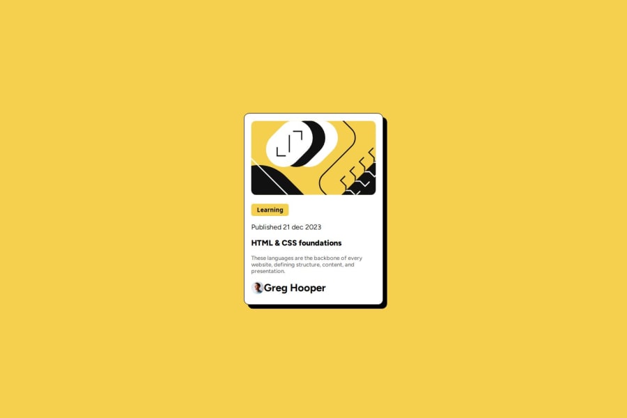
Cartão de pré-visualização do blog, alinhamento com grid layout
@Davi-log
Design comparison
SolutionDesign
Community feedback
- @salahelec2Posted 5 months ago
Hello! It's best to follow the Figma design specifications and use the exact font sizes, padding, etc. In the avatar area, use a slightly smaller font size.
Marked as helpful0@Davi-logPosted 5 months ago@salahelec2 muito obrigado pelo direcionamento não sabia <3
0
Please log in to post a comment
Log in with GitHubJoin our Discord community
Join thousands of Frontend Mentor community members taking the challenges, sharing resources, helping each other, and chatting about all things front-end!
Join our Discord
