Design comparison
SolutionDesign
Community feedback
- @correlucasPosted over 2 years ago
👾Hello Emad, congratulations for your new solution!
Great solution again brother!
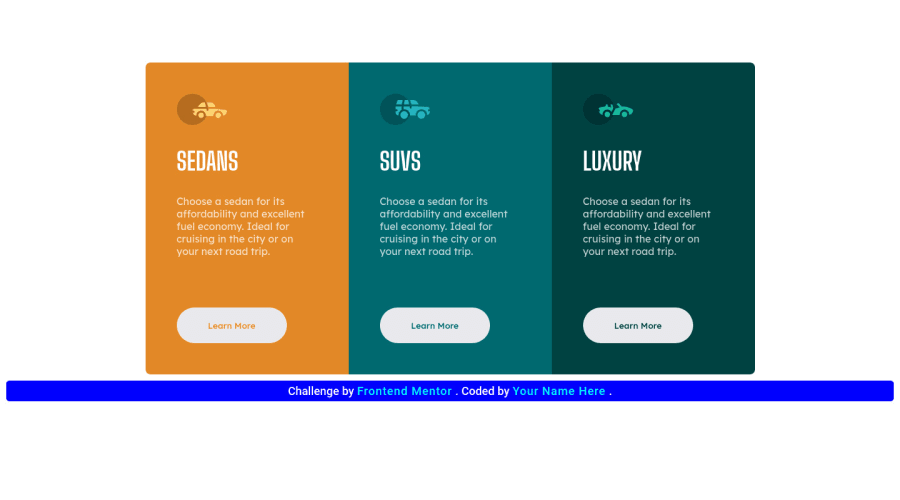
I liked a lots the custom bar with the creator name you've inserted here, well done!
To make your container / blue bar centered you need to remove the margins from the section and manage the alignment in the
bodyusingmin-height: 100vhandflex.See the changes below:
body {
    min-height: 100vh;
    display: flex;
    flex-direction: column;
    align-items: center;
    justify-content: center;
}

section {
    /* margin: 100px auto 0; */
    display: flex;
    justify-content: center;
    max-width: 100%;
}
👋 I hope this helps you and happy coding!
0
Please log in to post a comment
Log in with GitHubJoin our Discord community
Join thousands of Frontend Mentor community members taking the challenges, sharing resources, helping each other, and chatting about all things front-end!
Join our Discord
