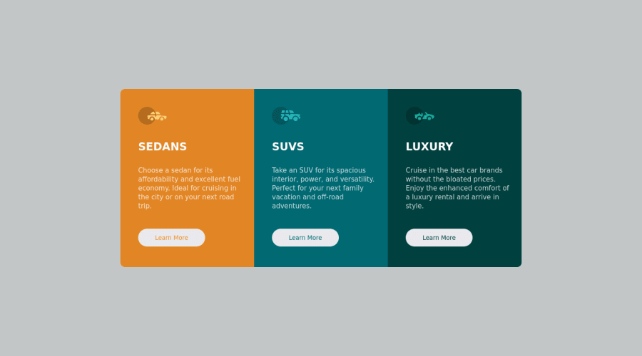
Design comparison
Solution retrospective
Cards HTML and CSS
It's not very original to the base project, but I hope the community likes it, I accept criticism
Community feedback
- @ColtensiemerPosted over 1 year ago
Hey Pedro,
Great job with this solutions! Your code looks well done and the result is great. I like how you mark comments on your CSS to help keep it more easy for others to read and understand.
I would recommend to always include an alt"" with text inside. This is for accessbility. It is a good habit to get!
Check out this resource to learn some more! https://developer.mozilla.org/en-US/docs/Web/HTML/Element/img
Marked as helpful1@MelvinAguilarPosted over 1 year ago@Coltensiemer Hello! Thank you very much for contributing to the community. Just one small thing: if an empty alt attribute is used, it's to make a screen reader ignore that image. It's used for decorative images like icons and images that don't add meaning to the web page. Reference: https://www.w3.org/WAI/tutorials/images/decorative/.
All the best. Melvin
1@ColtensiemerPosted over 1 year ago@MelvinAguilar
Ah! This is great for myself to learn and practice myself! Thank you Melvin.
0 - @MelvinAguilarPosted over 1 year ago
Hello there π. Good job on completing the challenge !
I have some suggestions about your code that might interest you.
- You should use only one
<h1>
tag per page. The<h1>
tag is the most important heading tag, This can confuse screen reader users and search engines. This challenge requires thatSedans
,SUVs
andLuxury
are headings, but you can use the<h2>
tag instead of the<h1>
tag. You can read more about this here π.
- You should not use inline-CSS because it is not a good practice. Instead, you should use an external stylesheet to style your page. By doing this, you will be able to have a better organization of your code and will be able to understand it better.
- There's no need to wrap an anchor tag inside a button tag as they serve different purposes and it's not semantically correct. Only use the anchor tag(<a>). You can check it on this website: https://caninclude.glitch.me/caninclude?child=a&parent=button.
I hope you find it useful! π
Happy coding!
Marked as helpful0 - You should use only one
- @0xabdulkhaliqPosted over 1 year ago
Hello there π. Congratulations on successfully completing the challenge! π
- I have other recommendations regarding your code that I believe will be of great interest to you.
HTML π·οΈ:
- Your solution generates accessibility error reports due to wrong usage
semantic
markup
- So fix it by replacing the
<section>
with semantic element<main>
and convert those three<main>
into<section>
to improve accessibility and organization of your page.
I hope you find it useful! π Above all, the solution you submitted is great!
Happy coding!
Marked as helpful0
Please log in to post a comment
Log in with GitHubJoin our Discord community
Join thousands of Frontend Mentor community members taking the challenges, sharing resources, helping each other, and chatting about all things front-end!
Join our Discord