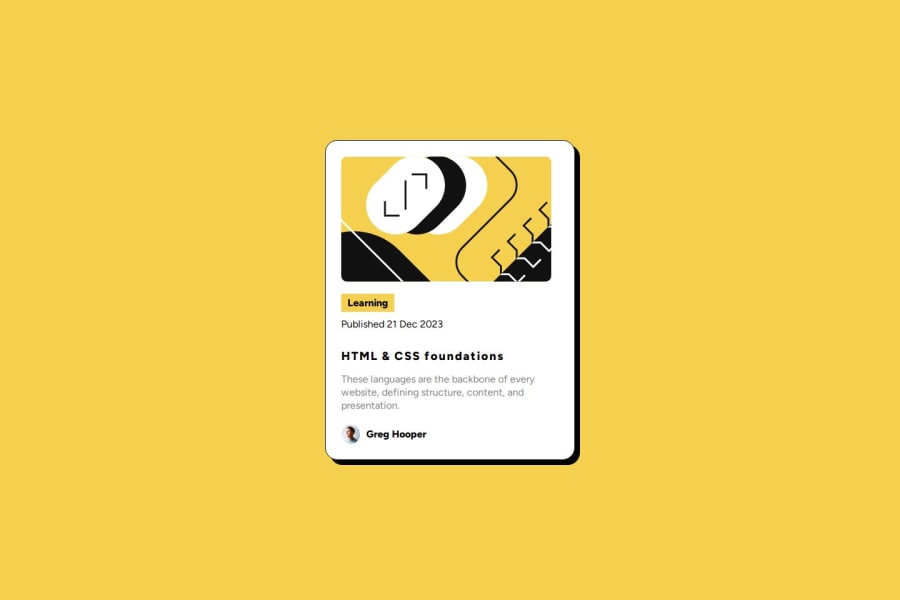
Design comparison
SolutionDesign
Solution retrospective
What are you most proud of, and what would you do differently next time?
I want to do differently next time my flexbox because I feel that I can take it better.
What challenges did you encounter, and how did you overcome them?This challenge was very easy so I didn't encounter it.
What specific areas of your project would you like help with?I would like to receive help in my knowledge about responsive design.
Community feedback
- @carstenkoernerPosted 9 months ago
Hola Moises2710,
your solution looks very well. I just have a few comments.
- Use more meaningful class names. section_1, section_2, etc. can't help other people reviewing your code. Have a look on the BEM methology.
- You don't need media queries for little projects like this. Use a max-width for the container.
- I did not recognize any letter-spacing in the headline in the template. But I could be wrong.
YM2C
0
Please log in to post a comment
Log in with GitHubJoin our Discord community
Join thousands of Frontend Mentor community members taking the challenges, sharing resources, helping each other, and chatting about all things front-end!
Join our Discord
