Solution retrospective
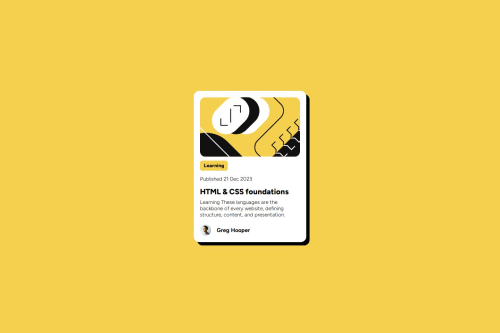
This project helped me improve my CSS skills, especially with responsiveness, box shadows, and layout alignment. I'm also pleased with how the card looks across different screen sizes, from mobile to desktop, maintaining both functionality and aesthetic appeal. Next time, I’d like to experiment with CSS Grid instead of Flexbox to achieve more layout control and responsiveness if I want to extend this project to include more cards or different layouts. I’d also consider making the card component more dynamic by adding JavaScript to handle interactive features, such as flipping the card or expanding it for more details.
What challenges did you encounter, and how did you overcome them?Keeping tests and code in sync, especially when using npm run test: watch in a dynamic environment. Ensuring your test coverage is comprehensive and regularly running tests during development can help catch issues early. Using a test-driven development (TDD) approach can also improve code quality.
Please log in to post a comment
Log in with GitHubCommunity feedback
No feedback yet. Be the first to give feedback on KunalLabs's solution.
Join our Discord community
Join thousands of Frontend Mentor community members taking the challenges, sharing resources, helping each other, and chatting about all things front-end!
Join our Discord