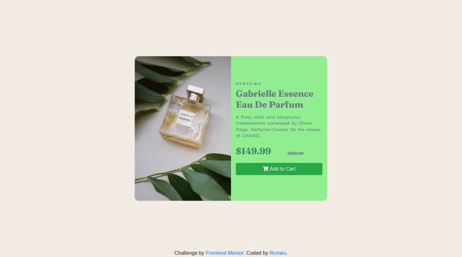
Design comparison
SolutionDesign
Solution retrospective
Frontend Mentor - Product preview card component
In this solution i used bootstrap structure. I'ts to assume css standards. I also started to see about commit patterns
Contém gambiarra
<img src="./images/code1.png" height="200px" width="300px"> <br> <img src="./images/code2.png" height="200px" width="300px">Community feedback
Please log in to post a comment
Log in with GitHubJoin our Discord community
Join thousands of Frontend Mentor community members taking the challenges, sharing resources, helping each other, and chatting about all things front-end!
Join our Discord
