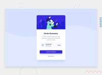
Design comparison
SolutionDesign
Solution retrospective
Do colors look different on every device? on my phone it looks different 🤡
Community feedback
- @karimfilaliPosted over 2 years ago
Hello, your card looks very great. The colors correspond to the recommended design. You have a tiny accessibility issue. The .desktop-patter and .mobile-patter images must be in the main tag. If you prefer, you can add them to the body with background : url("imageURL") contain no-repeat. Great job though !
Marked as helpful1
Please log in to post a comment
Log in with GitHubJoin our Discord community
Join thousands of Frontend Mentor community members taking the challenges, sharing resources, helping each other, and chatting about all things front-end!
Join our Discord

