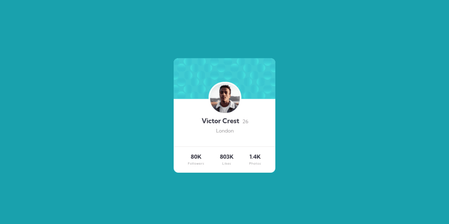
Design comparison
Community feedback
- @visualdennissPosted over 1 year ago
Hey, nice work!
I'd suggest not using margin with percentages to center items. It'll look only good on certain sizes but hard to control the change. Instead use this:
body, html { background: var(--dark-cyan); min-height: 100vh; display: grid; place-items: center; }
Also you can add background images like so:
background: url(images/bg-pattern-top.svg),url(images/bg-pattern-bottom.svg); background-color: #19a2ae; background-position: right 52vw bottom 35vh,left 48vw top 52vh; background-repeat: no-repeat,no-repeat;
(Just ensure the image path is correct)
Hope you find this feedback helpful!
1 - @Finney06Posted over 1 year ago
Hello there 👋. Good job on completing the challenge !
Here is a suggestion regarding your code that may be of interest to you.
HTML 🏷️:
To clear the Accessibility report:
- Always avoid skipping heading levels; Starting with
<h1>and working your way down the heading levels (<h2>,<h3>, etc.) helps ensure that your document has a clear and consistent hierarchy.
I hope you find it helpful!😏 Above all, the solution you submitted is 👌. 🎉Happy coding!
0 - Always avoid skipping heading levels; Starting with
Please log in to post a comment
Log in with GitHubJoin our Discord community
Join thousands of Frontend Mentor community members taking the challenges, sharing resources, helping each other, and chatting about all things front-end!
Join our Discord
