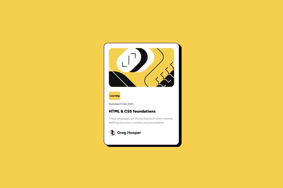
Design comparison
SolutionDesign
Solution retrospective
What challenges did you encounter, and how did you overcome them?
The hardest part was use Figma for my first time.
I mean it looks like Illustrator and any other desing program, but I still confusing about some information as font sizes, sizes of the content etc. So I need to learn more of Figma I guess...
Community feedback
Please log in to post a comment
Log in with GitHubJoin our Discord community
Join thousands of Frontend Mentor community members taking the challenges, sharing resources, helping each other, and chatting about all things front-end!
Join our Discord
