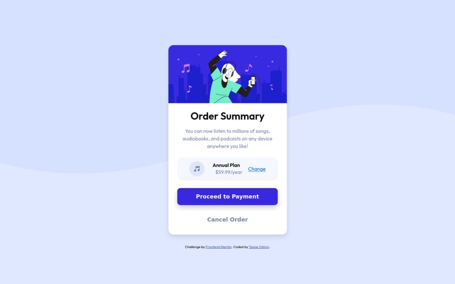
Design comparison
Solution retrospective
The part I have more difficulty with was trying to center the background waves on the center, but it was a fun project to build. Any advice on how to execute the project would be appreciated. Thanks!
Community feedback
- @GitHub-dev12345Posted almost 3 years ago
Used for proper background image : 😊👌
In body tag used this CSS property: body{ background : url("./images/uesd image path") no-repeat; background position: top center; background size: 100% 50%; ( this is your choice check the image performance, and the gave the size percentage on your choice); this code very helpful for your background image😉😎 keep it up; }
this code helpful for you, plz click on the mark the helpful
Marked as helpful0@tassieoshiroPosted almost 3 years ago@GitHub-dev12345 thanks brother! Sure will try to do that!
0 - @GitHub-dev12345Posted almost 3 years ago
Use this code to increase the size of card : 😊 used this CSS Property in your card to increase and decrease the size of card:
1.In Card design CSS Code Used this:
transform : scale(0.8); this property decrease the size of card. 😉
large size for increase the number of scale & small size for decrease the number of scale
Marked as helpful0 - @zeerobitPosted almost 3 years ago
Good work completing this challenge.. however when viewing it on my laptop part of the card is cut off since i'm unable to scroll due to the
overflow: hidden;property you added to the body. Adding this property to the body removes the scrolling bar which can cause issues when viewing this page on certain screen sizes such as my laptop .Happy coding !!!
Marked as helpful0@tassieoshiroPosted almost 3 years ago@zeerobit yes I was trying to take out the scrolling bar at the beginning of the project! thanks for letting me know!
0 - @NaveenGumastePosted almost 3 years ago
Hay ! Tassie Oshiro Good Job on challenge
These below mentioned tricks will help you remove any Accessibility Issues
-> Add Main tag after body
<main class="container"></main>-> Learn more on accessibility issues
If this comment helps you then pls mark it as helpful!
Have a good day and keep coding 👍!
Marked as helpful0 - @NParker33Posted almost 3 years ago
This looks great! One suggestion for centering the wave background is to remove the 'center/cover' values from the background property.
Marked as helpful0
Please log in to post a comment
Log in with GitHubJoin our Discord community
Join thousands of Frontend Mentor community members taking the challenges, sharing resources, helping each other, and chatting about all things front-end!
Join our Discord
