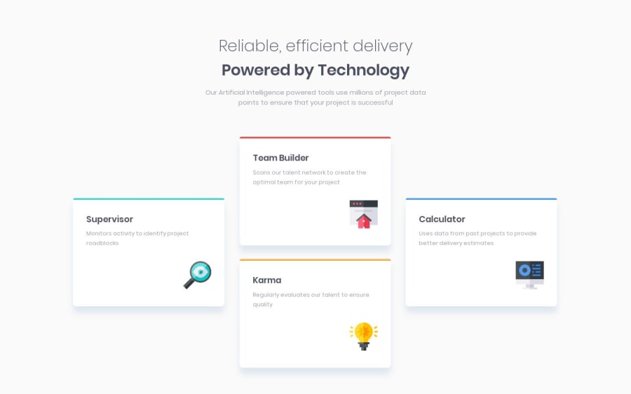
Design comparison
Solution retrospective
Had a blast with this one 👍. If something is off or glitching, let me know. Thanks!
Community feedback
- @mattstuddertPosted about 5 years ago
Hey Ann, I'm really happy to hear you enjoyed this challenge. You've done an amazing job! You've nailed the design and your project scales down really well to mobile. My only couple of recommendations revolve around the HTML:
- You've currently got multiple
h1elements. Although this is valid HTML it's generally still considered a bad practice, as it can cause accessibility issues with the content hierarchy. Instead, I'd recommend sticking to a singleh1. In this challenge, you could wrap both lines in a singleh1and then use thespanelement to differentiate the two lines. - You've used a
h4for the text below the heading, which I would describe as a paragraph. It's not really a heading for anything. However, each card does have a heading, which you're usingspanelements for. I'd put these as level 2 headings instead. Be sure not to skip heading levels unexpectedly, as this too can cause accessibility issues.
I hope that helps. Let me know if you have any questions. Keep up the amazing work! 👍
1 - You've currently got multiple
- @ann-devPosted about 5 years ago
Thank you for the feedback! I still have a lot to learn about accessibility 😅. I've adjusted my code according to your feedback!
0
Please log in to post a comment
Log in with GitHubJoin our Discord community
Join thousands of Frontend Mentor community members taking the challenges, sharing resources, helping each other, and chatting about all things front-end!
Join our Discord
